Mujin LOGO: The Hidden Meaning
Why is there no robot arm in the logo? CTO Rosen Diankov reveals the hidden symbolism behind the Mujin brand, distributed computing, and the brain philosophy.
“What’s in a name?” Shakespeare famously wrote in Romeo and Juliet. While Shakespeare’s characters argued names don’t change what lies beneath, in the world of technology and company branding, names and symbols carry deep purpose and vision.
What thoughts and engineering principles are embedded within the Mujin name and emblem? To uncover the story, we sat down with Mujin CTO and co-founder Rosen Diankov, who originally conceptualized the name and designed the logo.
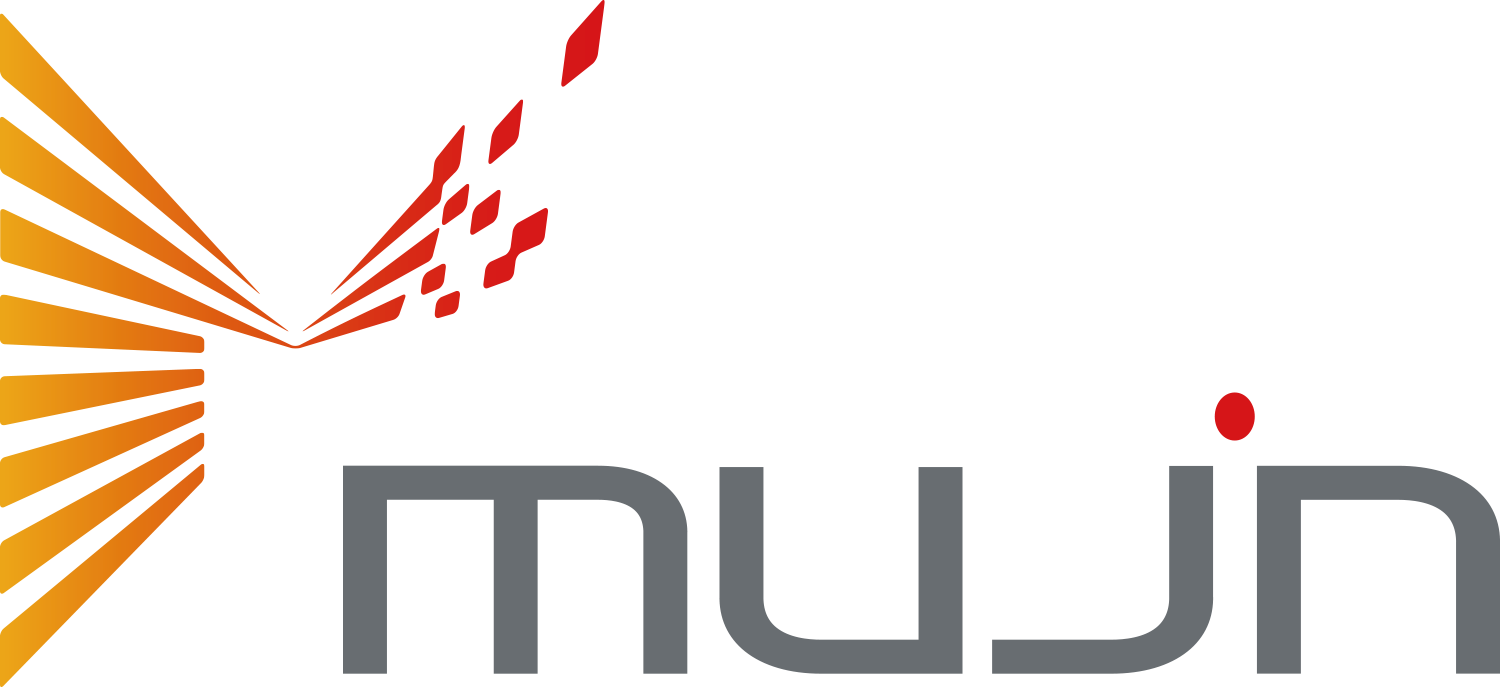
🔍 Four Core Concepts Hidden in Plain Sight
Through our conversation with Rosen, four core design elements emerge that define Mujin’s mission:
1. The Name: Unmanned & Boundless
A fusion of two Japanese concepts: 無人 (Mujin / Unmanned), eliminating dangerous physical labor, and 無尽蔵 (Mujinzou / Inexhaustible), representing limitless potential.
2. The 'M': Distributed Intelligence
Geometric converging lines visualize parallel and distributed computation—the mathematical heart of AI. An incomplete outer border signifies boundless growth and continuous evolution.
3. The Wordmark: The Brain & Rising Sun
In “mujin”, the stem of the letter “i” is absent—depicting a head without a physical body, signifying that Mujin builds the intelligent brain. The red dot pays homage to the Japanese flag.
4. Color Palette: Fire & Precision
Vibrant red and orange channel the fire, relentless passion, and energy of our engineers. Industrial slate grey represents mathematical precision and rock-solid stability.
🎙️ An Interview with CTO Rosen Diankov
Q1. How did the company name “Mujin” originate?
💬 Rosen: “Mujin” carries a double meaning in Japanese. It blends 無人 (Mujin), meaning “unmanned” or automated, with 無尽蔵 (Mujinzou), meaning “inexhaustible” or limitless potential.
When Issei Takino and I founded Mujin, we had one uncompromising conviction: to automate the high-difficulty industrial tasks that no roboticist in the world had yet managed to solve.
Q2. As a robotics company, why is there no robotic arm in the logo?
💬 Rosen: I was adamant: there should be no robotic arm in the logo. Because robotics has very little to do with manufacturing steel arms and mechanical joints. Hardware is just the physical vessel.
The true essence of robotics is the software, algorithmic intelligence, and real-time motion planning that breathes life into machines. Mujin is hardware-agnostic; our identity is rooted in universal robotic intelligence.
Q3. What is the story behind the geometric lines inside the letter “M”?
💬 Rosen: Look at the interlocking stripes: they geometrically depict Distributed Computation and Parallel Computation—the foundations of modern AI.
Robotics is an orchestration of many advanced disciplines:
- Computer Science & Algorithms
- Electrical & Electronic Engineering
- Real-Time Control Systems
- Database Architectures & Cloud Sync
- Mechanical Kinematics
The converging stripes represent these diverse engineering disciplines uniting into a central forward-pointing arrow that outputs practical real-world robotic applications.
Furthermore, the outer frame of the “M” is intentionally left open and incomplete. It stands for limitless possibilities—reminding us never to become complacent with what is already built.
Q4. There is also a secret hidden in the lowercase “mujin” wordmark?
💬 Rosen: Examine the letters in “mujin” carefully. The letter “i” has no vertical stem—only the red dot floats above.
That represents a human head without a physical body. The body is virtual; it reinforces that Mujin provides the cognitive brain rather than the physical machinery.
And by omitting the person (“i”), the wordmark playfully spells out the literal Japanese meaning of “無人” (No person).
Q5. What inspired the red dot and the color choices?
💬 Rosen: The red dot atop the “i” proudly echoes the Japanese Hinomaru (the Rising Sun).
When founding Mujin, I strongly believed that Japan offered the world’s premier manufacturing ecosystem, technological infrastructure, and industrial craftsmanship. Building Mujin in Tokyo was deliberate: we wanted to build transformative robotics from Japan out to the entire world.
As for our colors: orange and red represent fire—the blazing energy, drive, and passion required to conquer impossible problems. Meanwhile, slate grey conveys industrial rigor, deterministic reliability, and engineering precision.
Every line, angle, gap, and shade of the Mujin logo reflects our founding creed: transforming global logistics and manufacturing through intelligent, autonomous robotics.
Explore More Mujin Culture
Monthly All-Hands Meeting
How our 100+ global team stays unified behind a single automation mission.
World-Class Coffee
“Pursue the Highest Quality” embodied through Swiss JURA espresso machines.
Gourmet Free Lunch
Daily international buffet crafted by our in-house Michelin-trained chef.
Passionate about revolutionizing global logistics and manufacturing through robotic intelligence?
Explore Mujin Careers
We are actively recruiting passionate engineers and specialists eager to revolutionize industrial robotics.